
Works / RU'FINE
/ The mark


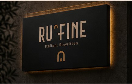
Drawn from the Roman aqueduct arch, filled with the amber of a wood oven. It replaces the apostrophe in the name.

A tighter lock-up for small formats: cup seams, brass tags, stamps, the corner of a box.

Amber on charcoal. The one place the accent colour is allowed to carry the whole mark.

Matt black paper, natural kraft, amber detail, blind emboss. Texture does the decorating.
/ The brief
The green white red flag, the script wordmark, the checked tablecloth, a cartoon chef with a moustache. It is a costume, and it puts a ceiling on what the place can charge and who walks in.
RU'FINE cooks Italian food properly: wood oven, San Marzano, handmade pasta, a short menu. The brand had to say that at a fine dining volume, in a room where people are also ordering a takeaway pizza in a box.
/ The idea
Italian. Rewritten. Two words that let the kitchen stay traditional while the brand does not.
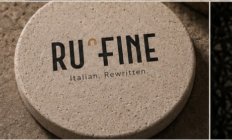
The wordmark is a geometric monoline capital, wide and evenly weighted, with the arch of a Roman aqueduct sitting where the apostrophe belongs. Amber fills the arch, the way the fire fills the mouth of the stone oven.
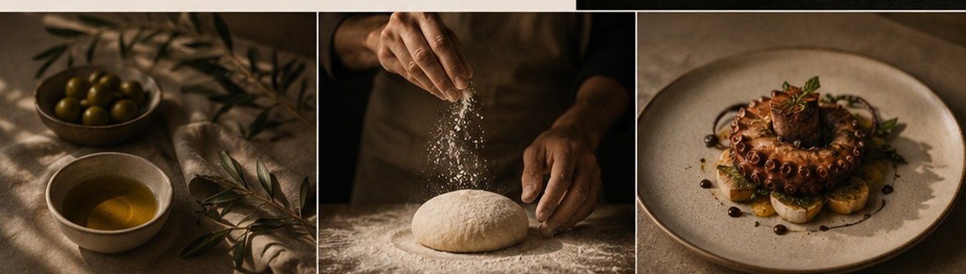
Everything else is material rather than ornament: travertine, matt black paper, kraft, one warm metal. Nothing in the system needs a flag to explain where the food is from.
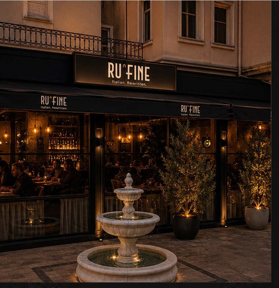

/ In the room
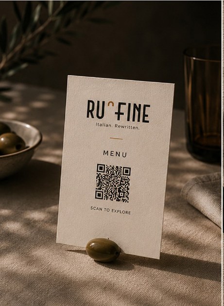
The mark is never printed twice the same way. It is blind embossed on the black card, cut into travertine on the coaster, and lit from behind in amber on the sign. One drawing, three materials, and the brand reads as expensive without a single decorative flourish.


/ Takeaway
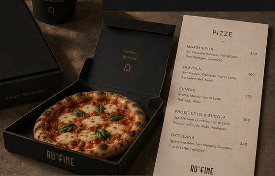
A pizza box is where most restaurant brands give up. This one keeps the same black stock, the same emboss, the same single amber seal, so the box that arrives at someone's door is recognisably the thing they saw on the street.
The kraft band across the bag is the only warm element in the pack, and it is also the seal. It has a job before it has a look.


/ Digital
The site runs on the same two grounds as the room: charcoal for the atmosphere, travertine for anything a guest has to read. Menu, reservation and the takeaway range all sit one tap from the top.

/ Uniform
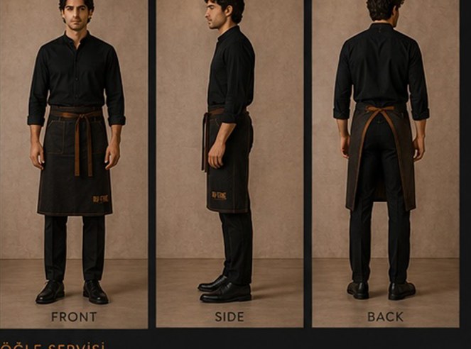
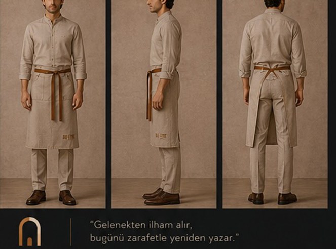
Two services, one wardrobe logic. Charcoal after dark, travertine at lunch, with the same amber apron tie holding both together and the mark embroidered rather than printed.
Mandarin collars, cotton and linen, a brass name tag. The staff read as part of the room instead of as a uniform catalogue.
/ The outcome
Brand, packaging, uniform and digital design produced by Pine-up.