
Works / Lera Fresca
/ The brand
Nature, craftsmanship and things made properly. A short list of products chosen for freshness, quality and design that will not date. The promise underneath all of it is a slower way of spending an ordinary day, where a small thing is worth stopping for.
None of which is easy to say on a 450 ml pot, through a fogged glass door, in about half a second.
/ The brief
A freezer cabinet is the least romantic shelf in the shop.
Lids face upward, pots stack, the light is fluorescent and the glass is half fogged. The customer decides from above, through a door they have not opened yet, and rarely picks the pot up before choosing.
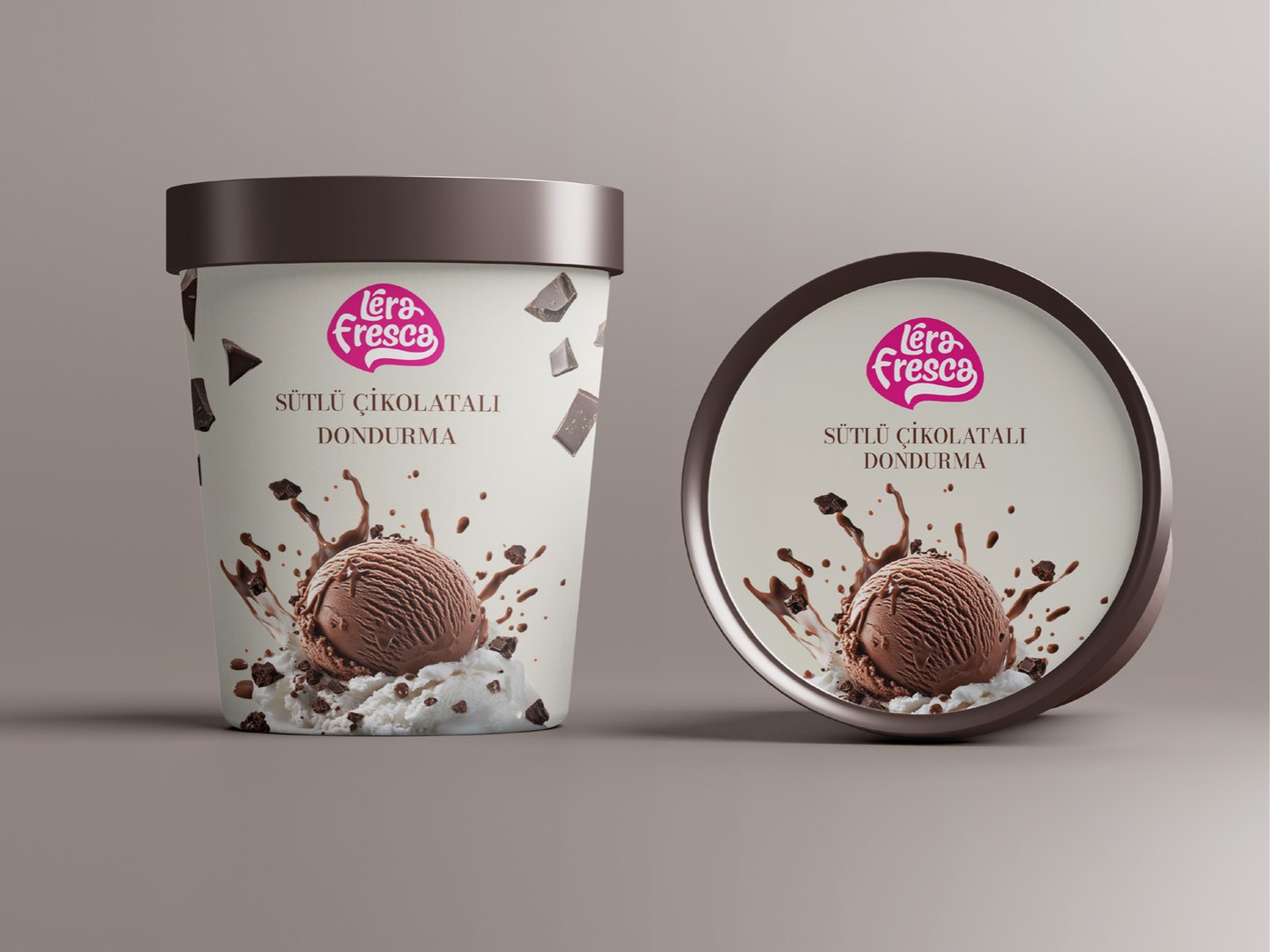
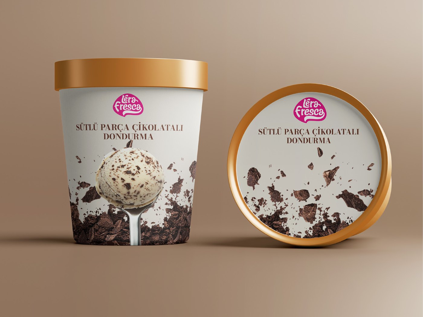
So the pack had to work twice over. Once as a lid seen from the top of a stack, once as a body seen from the front in a display fridge. Eight flavours had to read as one brand and still be told apart at a glance.
/ The system
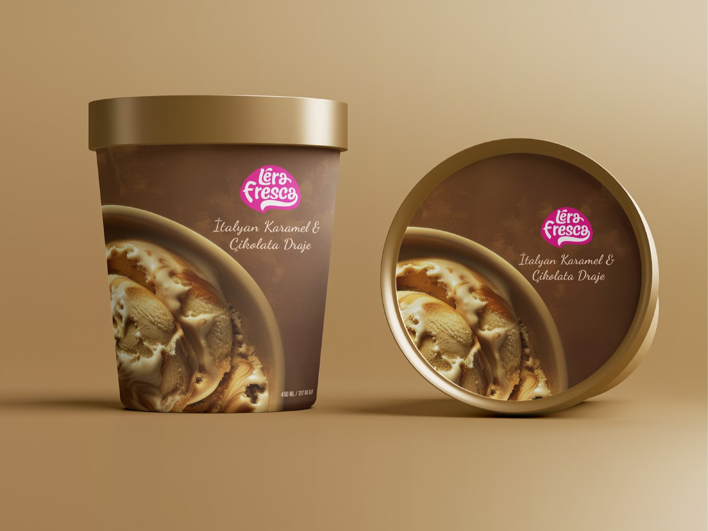
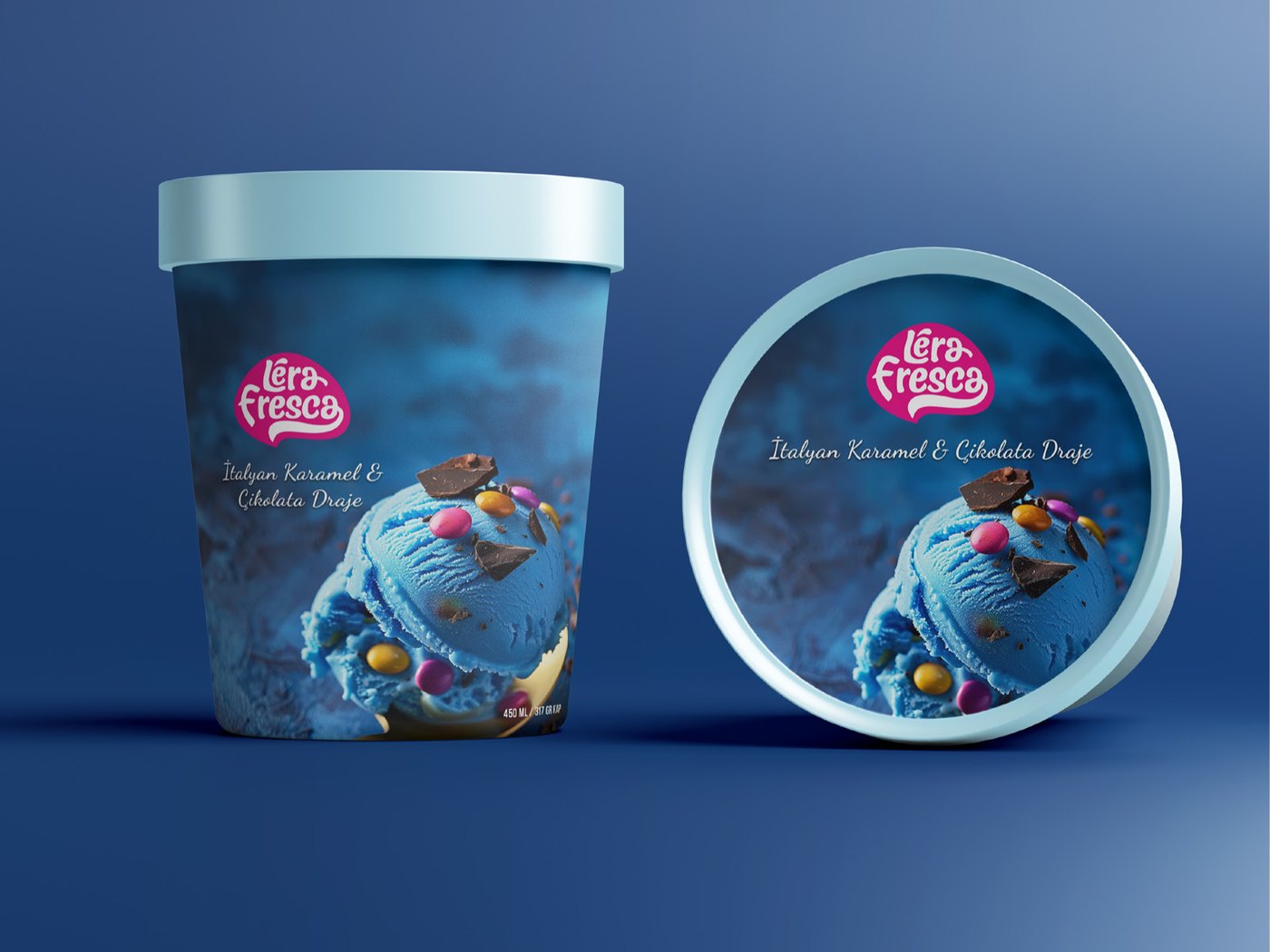
One hero image per pot, one product name, and the badge always in the same place. Nothing else competes for the surface.
The ground colour is the only thing that moves. Charcoal for Belgian chocolate, cream for milk chocolate, gold for caramel, sage for mint, marble and gold for tiramisu, rose for cheesecake. Flavour is carried by colour and by the photograph, never by a new layout.
The lid repeats the body instead of reinterpreting it. Same badge, same name, same image. A stack of pots reads as a column of one product, and a row of them reads as a range.

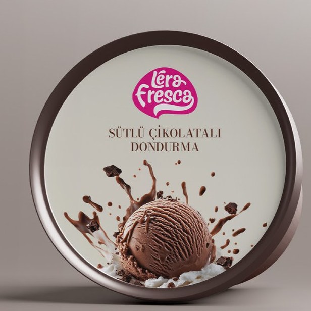
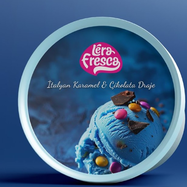

The pink badge is the only element that never changes and the only colour that is never adjusted. It holds on charcoal, on cream, on blue and on marble without being restated in any of them, and that is what makes eight different pots read as one shelf.
/ The range
Eight flavours, each with its own photograph and its own ground, all built on the same grid. Weight and volume sit bottom right on every body, in the same size, so the legally required line never has to be designed around twice.



/ The outcome
Packaging design produced by Pine-up. Brand mark belongs to the client.