
Works / Beylerbeyi Rakı
/ The brief
The category is closed to advertising. No billboards, no press, no film, no sponsorship, no influencer. What is left is the bottle on the shelf and the brand's own website, and only one of those two lets the brand finish a sentence.
So the site could not be a catalogue with a shop attached. It had to carry the distillery, the vineyard, the anise and the process, and still sell a bottle at the end of all that.
/ The idea
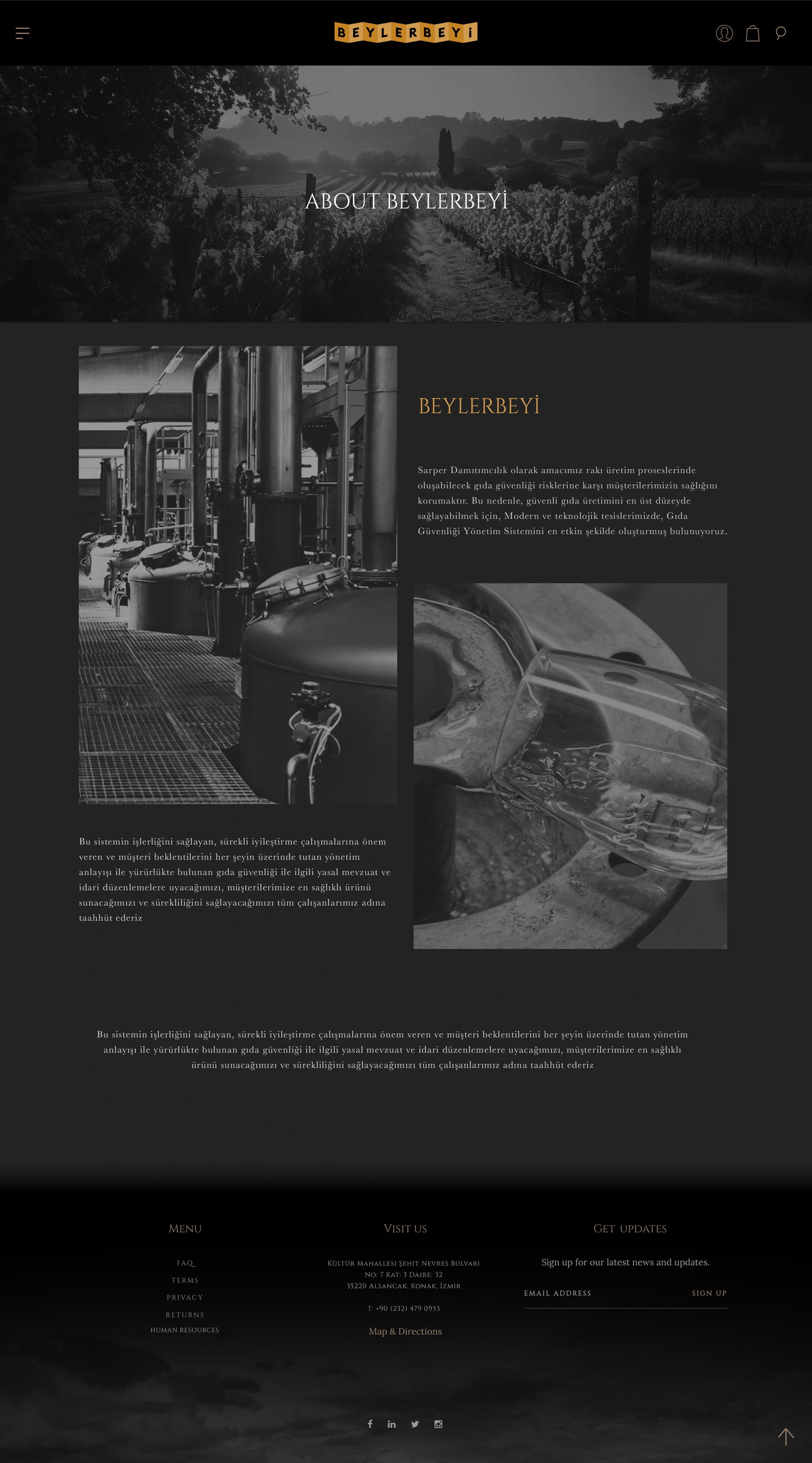
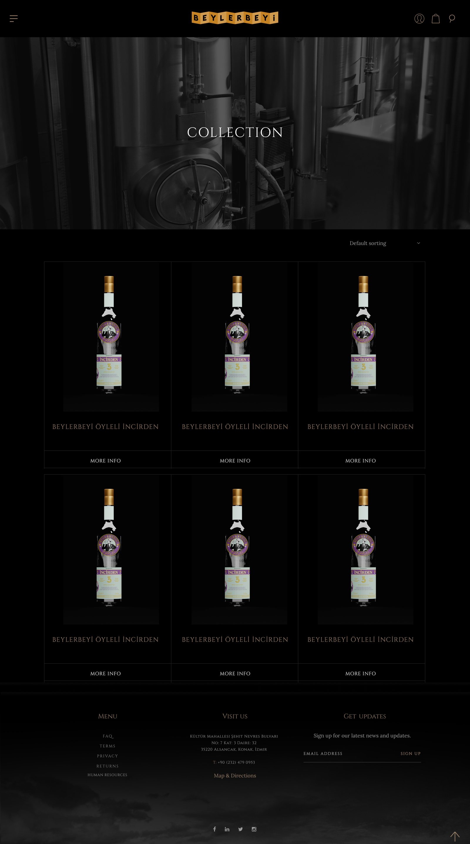
Everything monochrome except the label. The only colour on the site is the product.
Photography is desaturated on every page: copper stills, vineyard rows in the mist, water clouding in the glass. Against that, the gold logo tiles and the purple and mint label are the only saturated things a visitor ever sees. It is a hierarchy the shelf already uses, moved onto a screen.
Type is a high contrast serif, letterspaced wide and set in small caps for navigation and labels. That single choice is what makes the site read as old rather than as another expensive modern spirits page.

/ The journey
The home page is not really a page, it is the first frame of a sequence. A numbered rail runs down the left, 01, 02, 03, and walks a visitor through vineyard, grapes and distillation one full screen at a time, with a single line at the bottom: continue the journey.
The logo sits centred over the still house rather than parked in a corner. On first load the brand is the entire screen, which is the closest thing to a billboard the category is allowed.
/ The bottle
Collection is deliberately plain. By the time someone reaches it they have decided to shop, and atmosphere at that point only slows them down.
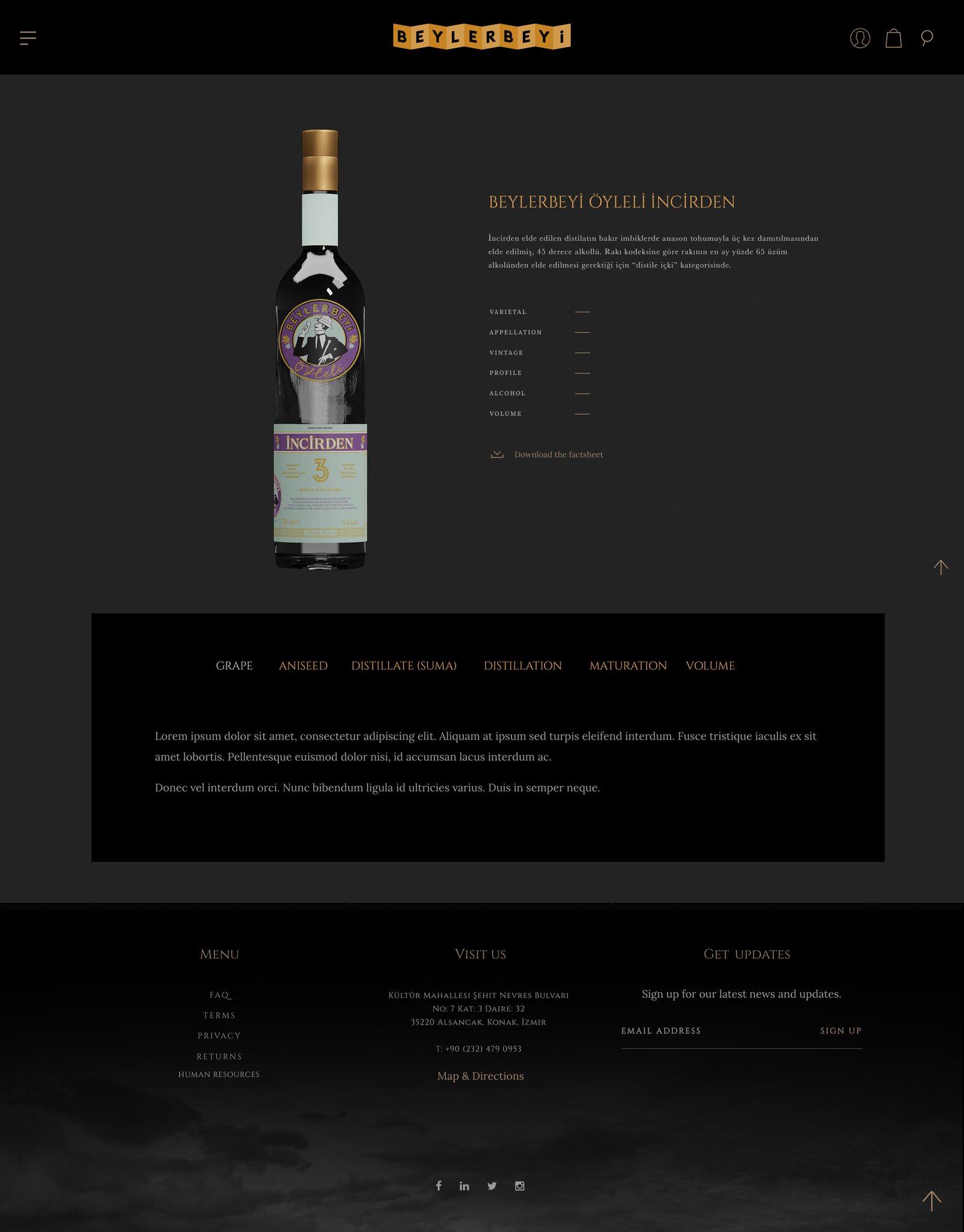
The product page is where the detail sits. A spec list in the language the category actually uses, varietal, appellation, vintage, profile, alcohol and volume, with a downloadable factsheet underneath for the trade. A tab strip then splits the story into grape, aniseed, suma, distillation, maturation and volume, so a visitor can read as far as they want without pushing the buy decision further down the page.
/ The outcome
Website design produced by Pine-up. Brand mark and product photography belong to the client.