
Works / Galen Spa by Natura Bissé
/ The name
For decades he has worked on elite athletes, national team players and people whose bodies are asked for more than most. One belief never moved through any of it: real recovery is never only about treating the pain. It is about reading the body as a whole.
That is not a modern idea. Nearly two thousand years ago Galen of Pergamon argued exactly the same thing, that movement, recovery, balance, touch and the way a person lives are one subject rather than five. His work was not to repair an injury but to help a body repair itself.
So the name was not invented to sound old. It was picked because the philosophy was already in the room, and it had a name long before the spa did.
Restore the body. Calm the mind. Respect the balance.

/ The mark

/ The look
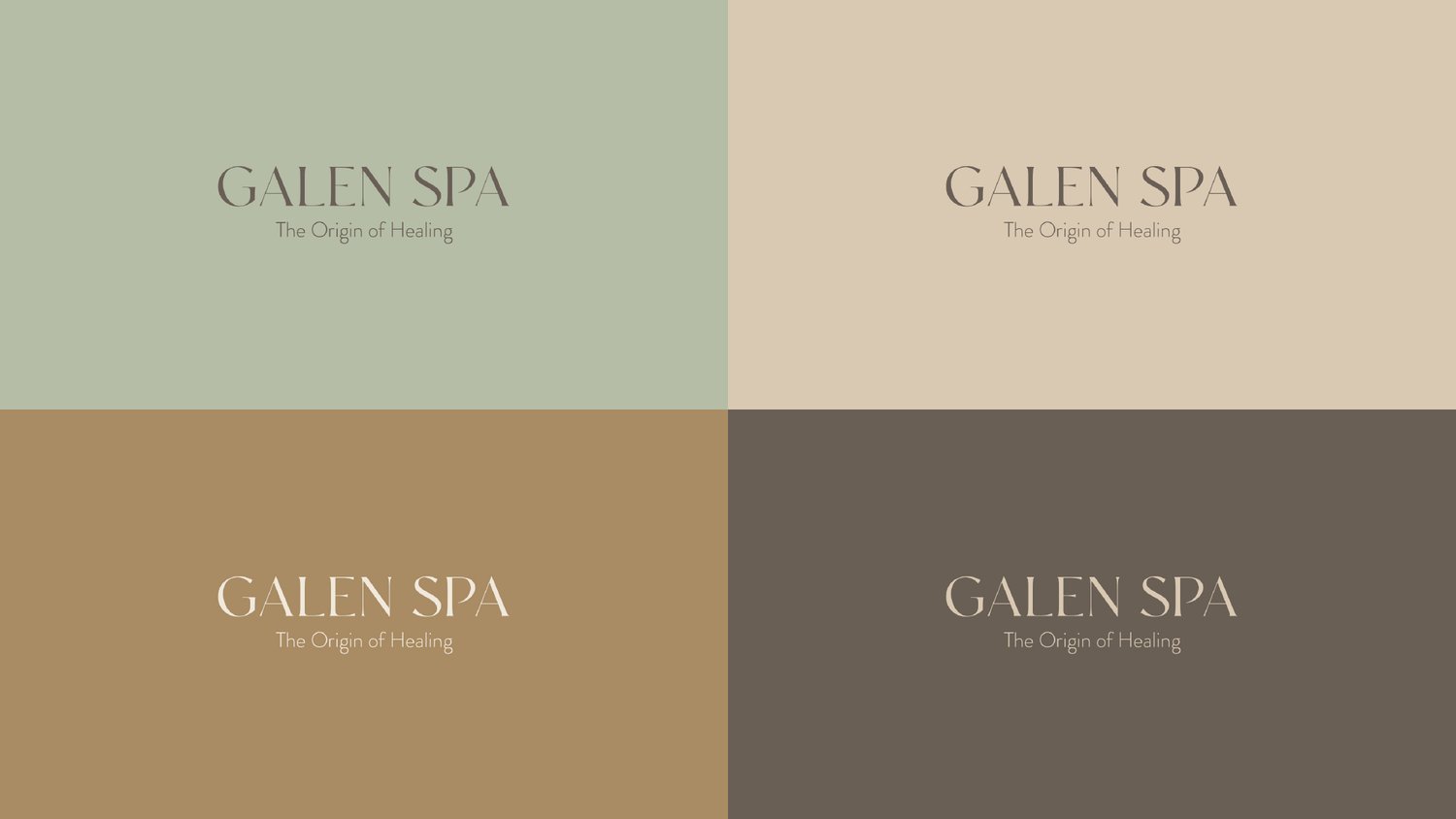
A high contrast serif with an angled apex on the A, letterspaced wide enough that the name reads as an inscription rather than a sign. Under it, the line in a soft geometric sans so the promise never competes with the name.
The palette is five values and nothing else: sage, sand, cream, gold and stone. Every one of them is a material that already exists in the building, which is why the mark holds on a wall, on a candle and on a screen without being adjusted.
/ Products
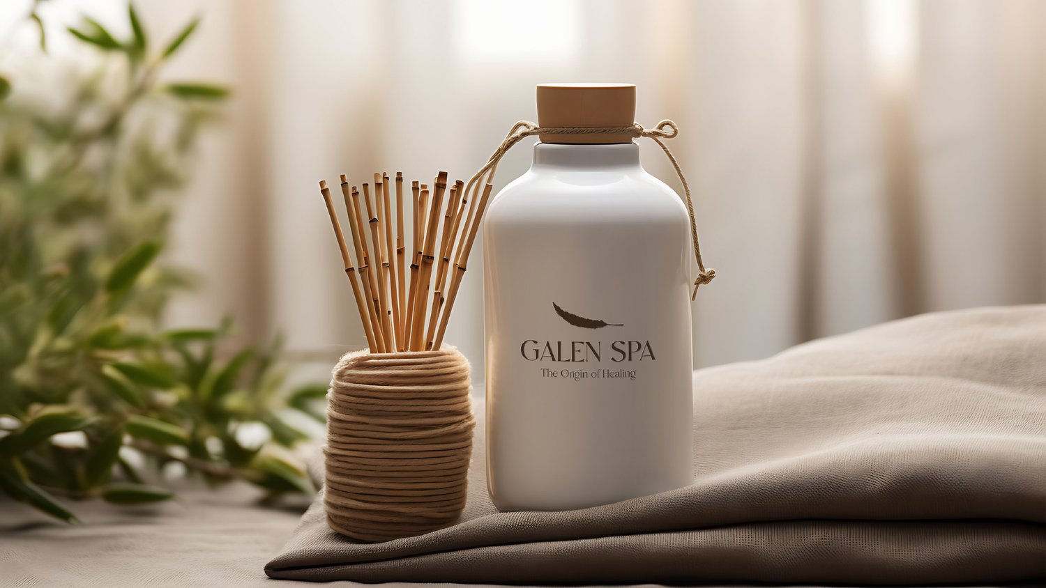
The retail line carries the same restraint. A candle, a diffuser, a treatment bottle, each with the lock-up small, centred and high on the label, and a single engraved illustration doing the work a photograph would usually do.
Product names stay clinical rather than poetic. Panacea, a reference code, a volume. It reads as something prescribed, which is the register the whole brand is built on.


/ The film
The commercial was written, directed and produced in house, and so was the music under it. Composing the score rather than licensing one meant the cut and the sound were built to the same rhythm instead of being matched afterwards.
It is the piece that does the thing a spa brochure cannot: it shows the pace. Nothing in it is hurried, which is the entire proposition.
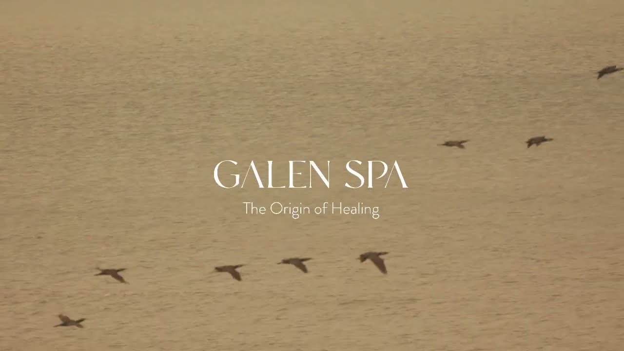 Commercial film · Concept, production and original score by Pine-up · Watch on YouTube
/ The site
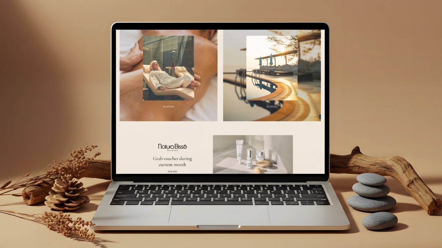
Cream ground, thin rules, one column of centred type, and photography that is allowed to be large and quiet. Navigation runs in Turkish across anasayfa, hakkımızda, hizmetler, şubeler, galeri and iletişim, with book now held at the right edge on every screen.
Amenities are handled as one wide image with markers on it rather than as a list of cards, so a visitor reads the space before they read the services. Sauna options open as an accordion underneath, and the Natura Bissé partnership gets its own band rather than being buried in a menu.




/ Social media
We still run the account. The register is deliberately narrow: minimal, sensory, no emoji, no exclamation marks, short lines that sound like something said quietly in a treatment room rather than posted.
It is the one channel where the brand speaks every week, so keeping the voice at that volume matters more than any single post does.
/ The outcome
Naming, identity, packaging, website design, film, music and social media produced by Pine-up.