
Works / CCR Hotels & Spa
/ The mark

Half the cap height of the C, kept empty on all four sides.
220 px 44 px
44 pxUnder 220 px the descriptor closes up, so the symbol runs alone.
One ink on uncoated stock. Gold exists as foil, never as a colour value.

Bone on a solid ground, or blind embossed with no ink at all.

/ The brief
In 2015 Cappadocia had hundreds of cave rooms and one photograph: balloons over Göreme at six in the morning. Scrolling the region, a guest could not tell one property from another, and CCR was running several houses under a single name.
Three things were needed at once. A mark that survived being blind embossed on a leather folder and posted at 640 pixels in the same week. A picture library that belonged to the brand and to nobody else. And a voice that turned up daily rather than once a season.
/ The identity
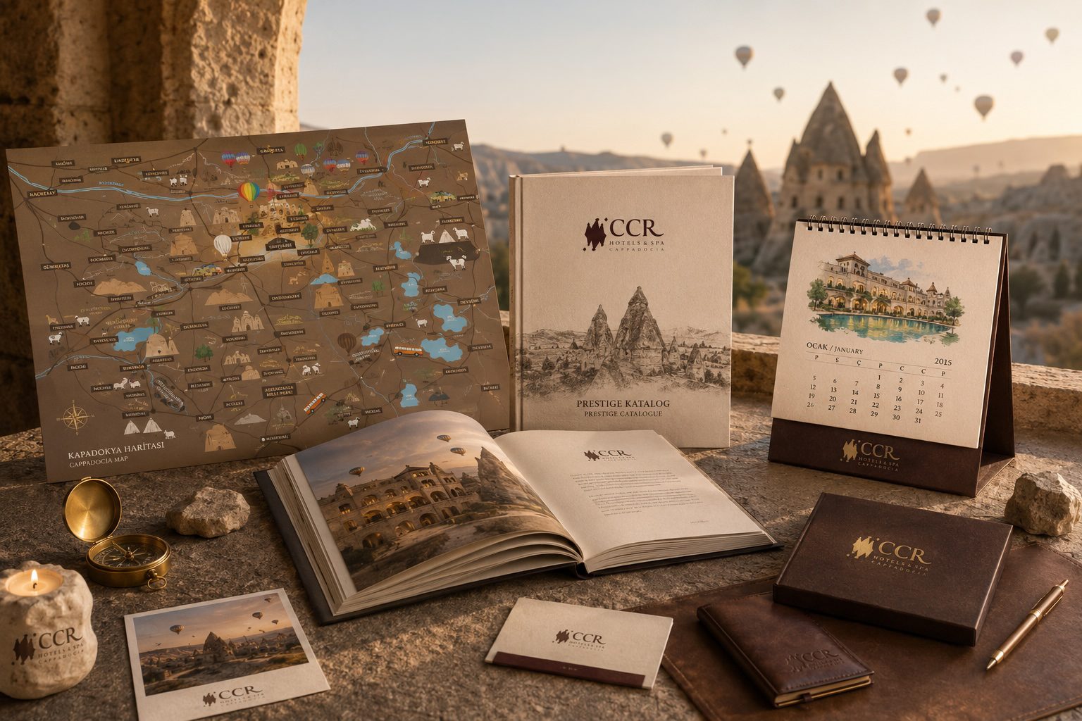
Three chimneys brushed in a single pass, with the loose diamonds beside them standing in for the caps that break off the rock. Everything else came out of the material of the place. Tuff beige stock, a wine brown lifted straight from the symbol, gold used once per piece and never twice.
The prestige catalogue opens on a pencil drawing of the valley rather than a photograph, so the pictures inside arrive as a surprise. The map is illustrated, not accurate. Every village, every chimney, every stray goat is drawn by hand. It is also the piece guests actually take home, which quietly made it the most widely distributed thing the brand ever printed.
/ Photography
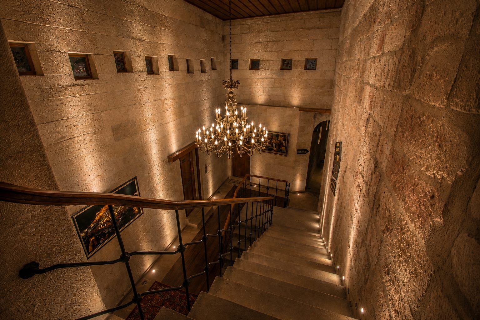
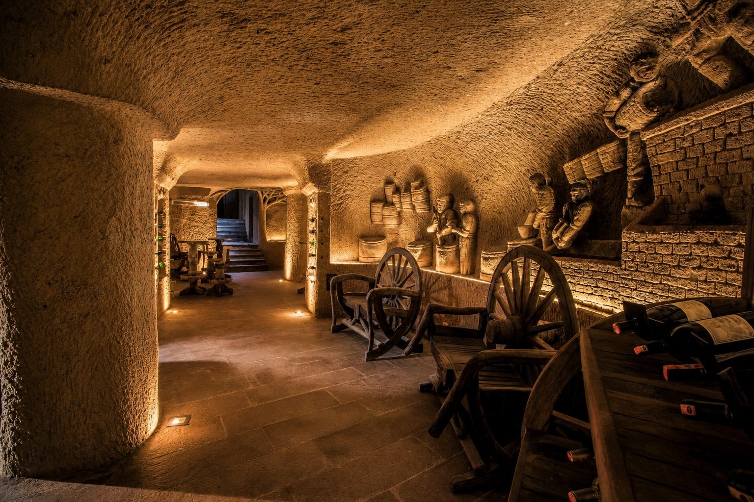
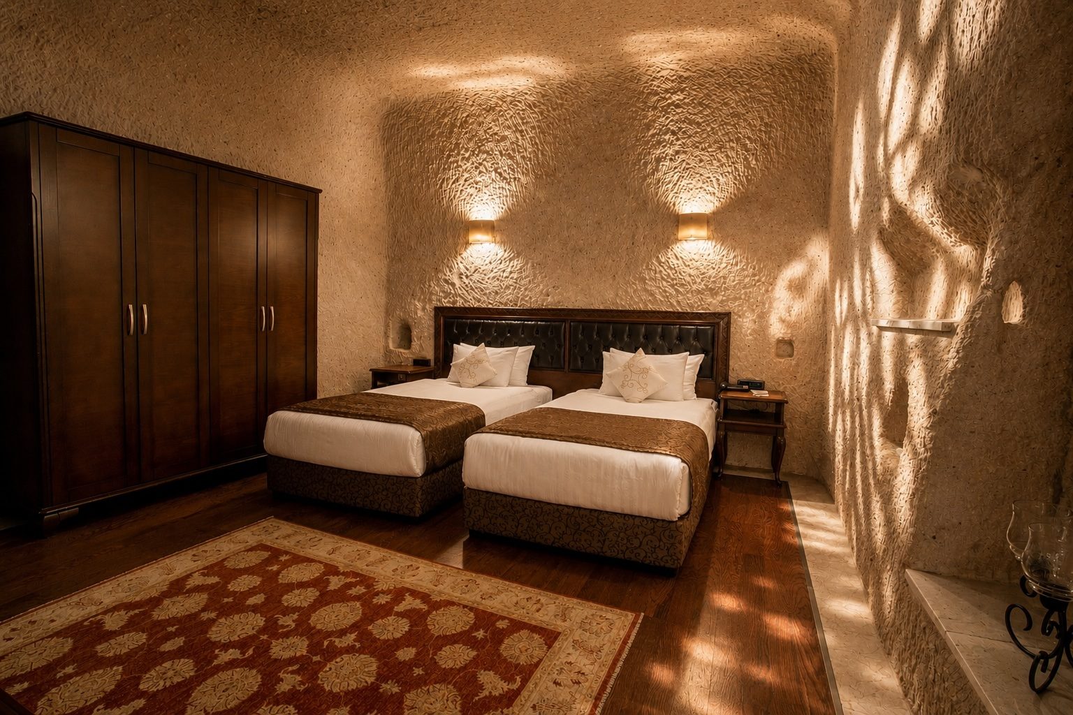
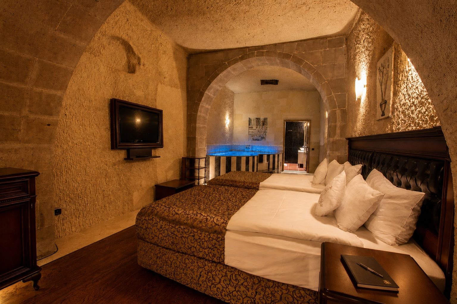
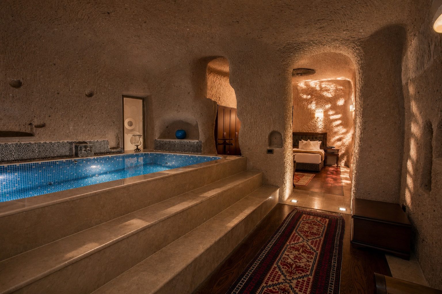
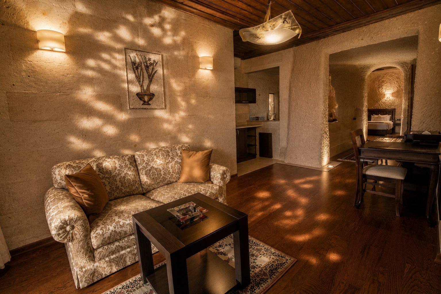
The valley is the most photographed place in Turkey. So we turned the camera around and shot the inside of the rock.
Two nights on the property, available light wherever the stone allowed it. Rooms were lit the way they actually look at nine in the evening, with the lamp wash left on the chiselled walls instead of being flattened out by a second head.
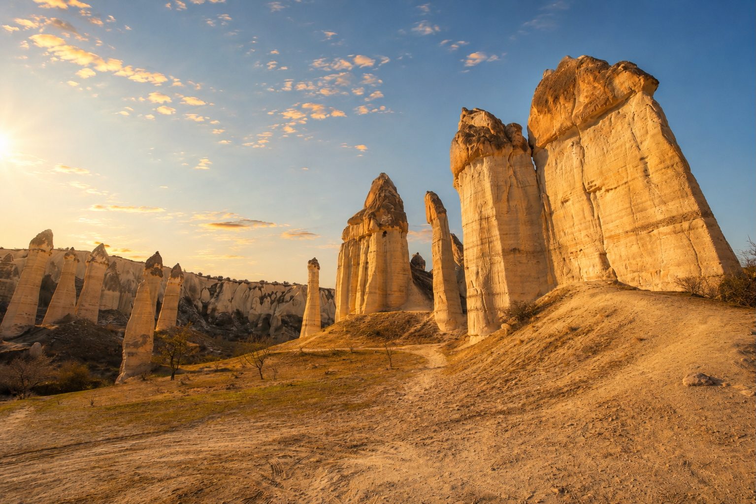
The landscape stayed in the set, but only as a way out. It arrives in the last two frames, after the corridor, the cellar and the rooms have done their work.





/ Social media
Social media ran on that library for a full year. Instagram in 2015 was square, small and unforgiving, so frames were composed to survive a 640 pixel crop: one arch, one light source, one texture, nothing that needed a caption to explain it.
Nothing on the feed was bought in. Every post came out of the property itself, which is the part the valley cannot copy.
/ The outcome
Produced in 2015. The mark, the catalogue and the picture library are still in service.