
Works / Antikya
/ The mark

One a on all four sides, measured off the bowl of the wordmark's own a.
25 mm25 mm across in print. Below that the descriptor stops setting cleanly on label stock.
A serif for names and headlines, a plain grotesk for anything a shopper has to read quickly.

Off white on deep brown. The red never sits on a dark ground, it goes flat.
/ The brief
The shelf is full of the same signals: a hand drawn village, a script that pretends to be someone's grandmother, a gingham lid. Tradition gets announced instead of shown, and every producer ends up looking like the same producer.
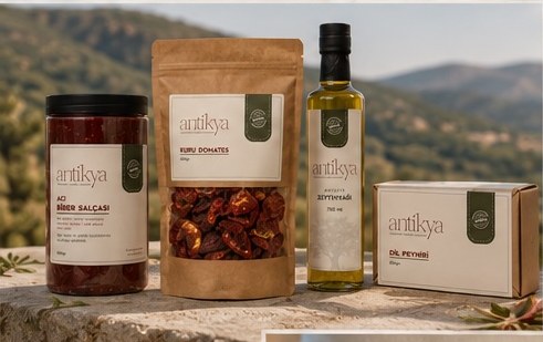
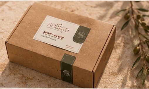
Antikya sells one city. Salça, kuru domates, zeytinyağı, dil peyniri, nar ekşisi, made to Antakya recipes. The brand had to read as heritage with none of the fancy dress, and it had to hold across a glass jar, a kraft pouch, an oil bottle, a cheese box and a shipping carton.
/ The wordmark
One word, set in a light high contrast serif, all lowercase, with a single long swash carrying the y below the line. The brand introduces itself at a normal volume rather than shouting about how old the recipe is.
The descriptor sits underneath in olive, so both pantry colours are already inside the logo before anything is printed. Red names the brand, olive says what it is.

/ The pack
One label, five formats, and a green tab that has to survive being seen from two metres away.
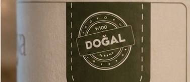
Uncoated beige stock, the wordmark at the top, the product name under it in a plain grotesk, and the olive tab hanging off the right edge with the DOĞAL stamp on it. The tab is the part that makes a jar, a pouch and a carton read as one family before anyone is close enough to read a word.
The dashed stitch line around that tab is the only decoration in the whole system, and it is printed at the same size on every format, from a 750 ml bottle to a shipping box.


/ Photography
Everything was shot in daylight against the materials the food already lives with: stone, linen, unglazed clay, an olive branch that was actually in the frame rather than added later.
The rule for the whole set was simple. The food had to look edible before it looked photographed. No sweep, no gloss, no styling a home kitchen could not reproduce.
/ The deck
Identity, packaging and photo direction went to the client as one document, so the rules and the pictures that prove them sit on the same page.

/ The outcome
Logo, packaging and photography produced by Pine-up.