
Works / Odeabank
/ The brief
Odeabank was established in 2012 and opened its first branch in Maslak that November. Everything an older bank borrows from habit, the sense that it has always been on that corner, had to be built from nothing and built quickly.
The bank describes its ambition as phygital, a branch network and a digital product treated as one thing rather than two. That single word sets the whole design problem. The brand has to be equally correct on a letterhead, on a card, on a branch wall and inside an app that a customer opens forty times a month.
So the deliverable is not a logo presentation. It is an inventory.
/ The mark
Black and white, and nothing else to hide behind.
The symbol is a set of sliced diagonals resolving into two overlapping counters. It carries movement without illustration, which matters in a category where every competitor reaches for a leaf, a shield or a key.
There is no gradient and no second colour, because the mark has to hold at every size a bank needs. Twenty-four pixels in a phone status bar, embossed on a card, cut into a branch facade, printed on a sponsorship board seen from a hundred metres.

/ The inventory
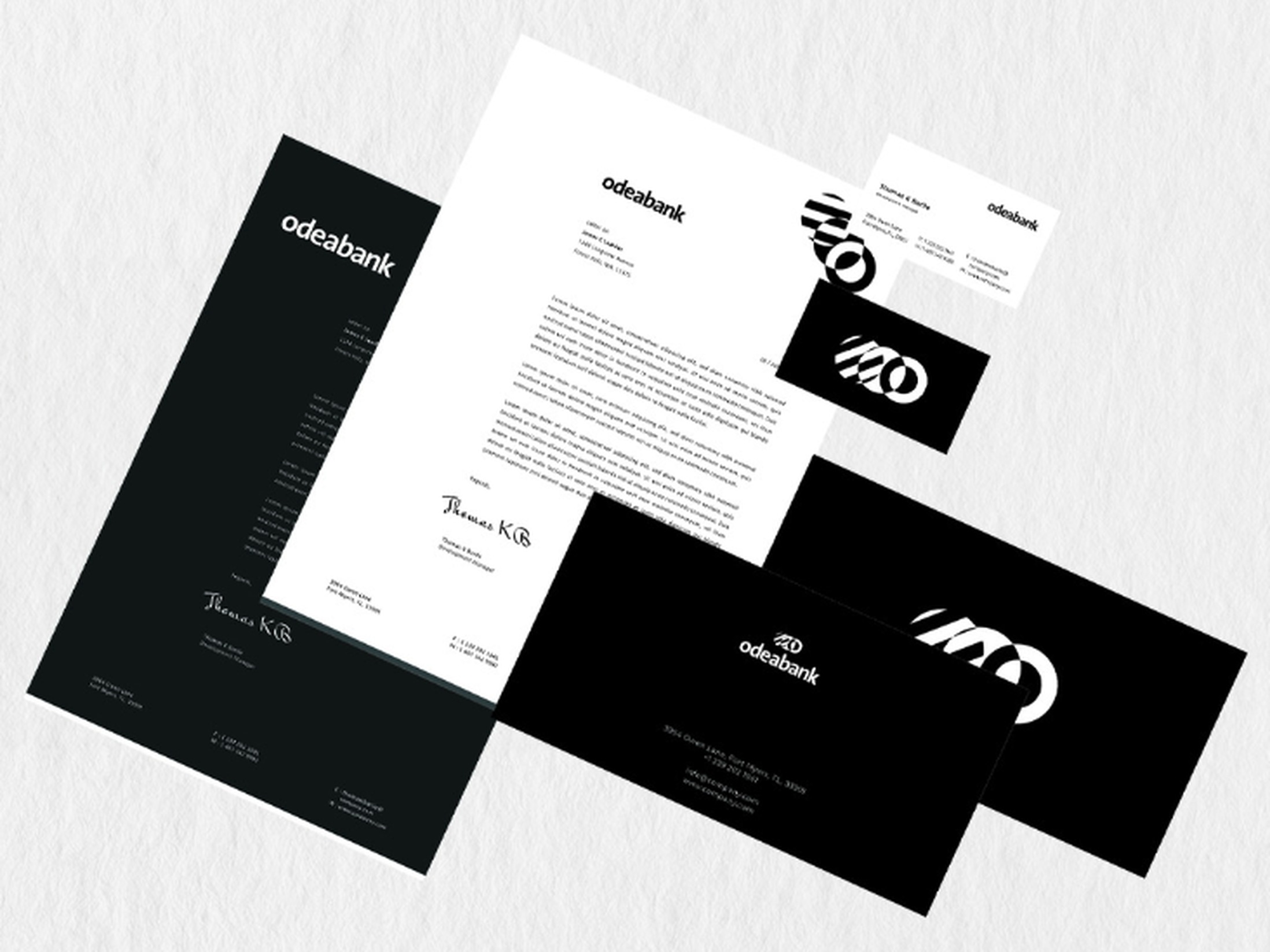
The corporate identity inventory covers logo usage, typography, the colour palette, iconography, corporate document templates, digital interface components and physical applications. Each element is standardised rather than merely illustrated.
The reason is operational. A bank produces work in parallel, all the time, through agencies, branch teams, product teams and print suppliers who never meet. The inventory is what makes their output arrive as one bank instead of five.
/ Odea
Banking and investing in one place, not two products that happen to share a logo.
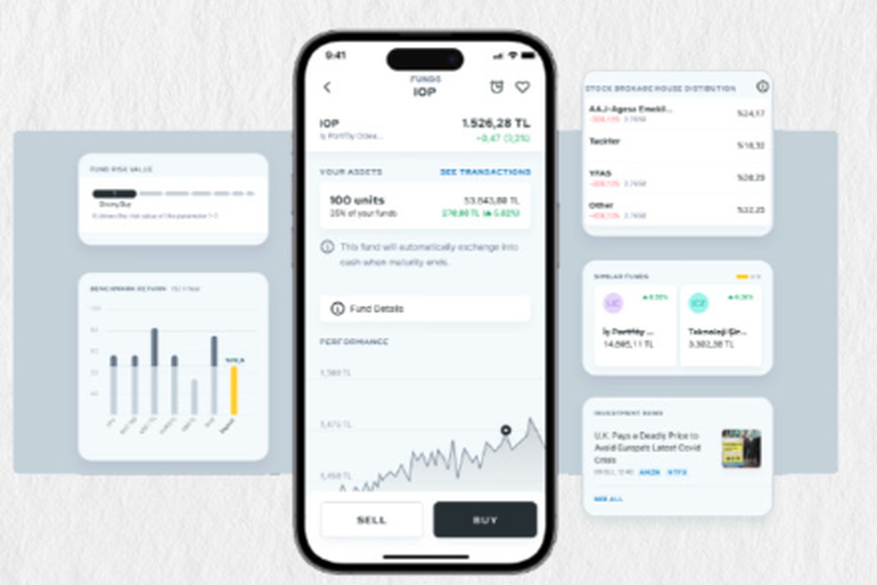
Odea is the bank's financial super app. The investment screens carry the most weight, because that is where the product has to be trusted. A fund page shows the position, its share of the portfolio, the performance curve and the two decisions available at the bottom of the screen. Everything a customer needs to act is above the fold. Everything explanatory sits underneath it.
The same system runs on desktop and tablet. Four sections carry the whole product: banking, investments, goals and support. Balance sits at the top of the banking view, recent activity underneath, and the four common actions in between where a returning customer expects them. Nothing is redrawn per device. The tablet is not a stretched phone and the desktop is not a shrunken website, but they read as the same bank, which is the only test that matters.
The interface stays close to the identity. White ground, near black for weight, and one accent used only where a number changes. Colour means something here, so it is spent carefully.

/ The outcome
Identity inventory and interface work produced by Pine-up. Brand mark and product screens belong to the client.